Brand identity
An identity shaped by time.
The Relic Timber identity pairs editorial restraint with the organic evidence of growth rings, ancient material, and natural transformation.
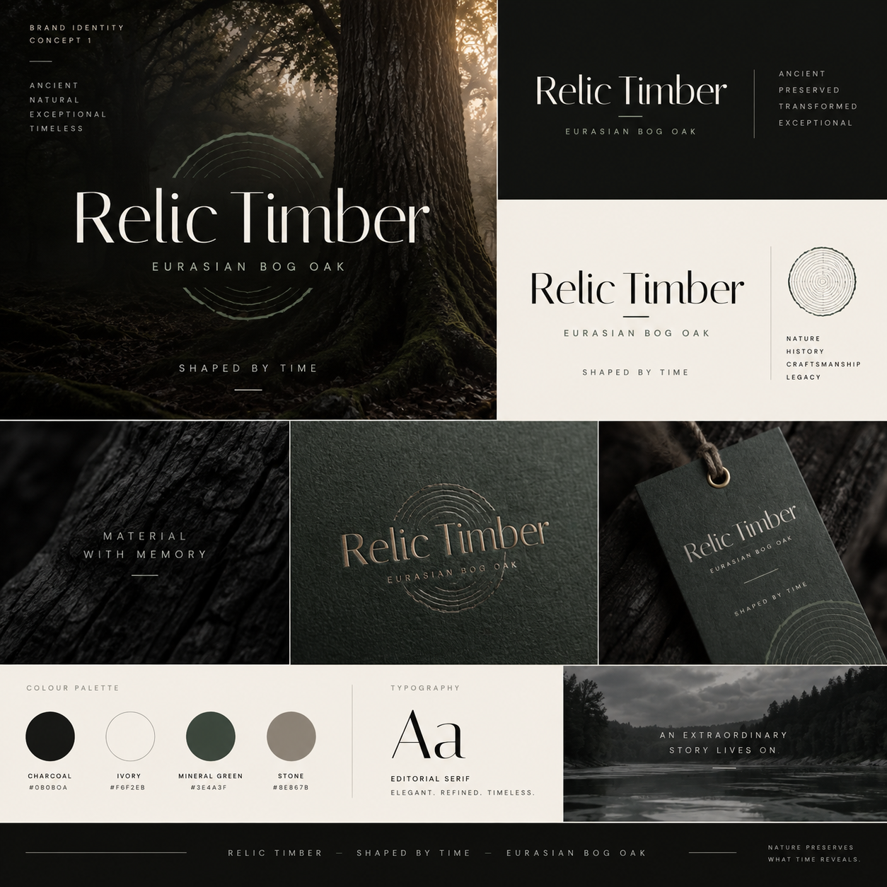
The complete identity brings forest, river, material, and craft into one restrained visual system.
History held within the name.
The concentric lines recall the growth record within a tree and the passage of time that defines Bog Oak. They frame the name without turning the material into decoration.
The horizontal logo is the primary signature. It should remain clear, spacious, and high contrast—ivory on charcoal or charcoal on ivory.
Charcoal
Foundation
Ivory
Light field
Mineral green
Natural accent
Stone
Supporting neutral
Aa
Editorial serif
Elegant, refined letterforms carry the sense of history. A precise sans serif supports captions, navigation, and factual material information.
Material first
Quiet, tactile, and elemental.
Imagery
Forest, water, grain, surface, and finished form are shown with depth and restraint. The material remains the protagonist.
Voice
Measured and factual. Language communicates rarity and transformation without exaggeration or unsupported claims.
Composition
Generous space, architectural alignment, fine rules, and considered contrast create a museum-like rhythm.
Signature
Time → Material → Craft → Object expresses the full journey in its most concise form.
Begin a conversation
Carry the identity forward.
For considered collaborations, applications, or brand-related inquiries, begin a conversation with Relic Timber.